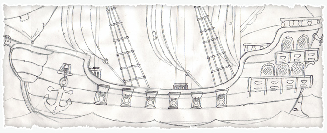
Now we’re heading towards getting all of the cartoon pirate characters completed for The Pirate Deck game, I need to begin work on the packaging.
Most of this will be created elsewhere, but the task has fallen upon me to create dome pirate lettering to be used on the packaging.
This will form a kind of ‘logo’ for the brand and needs to reflect the look and feel of the game.
Creating the pirate lettering
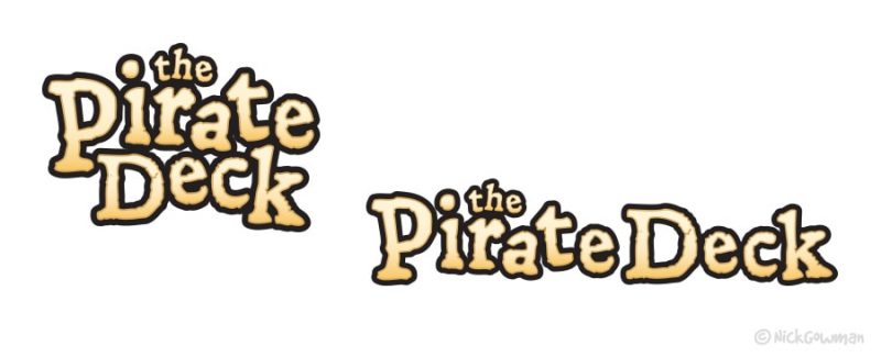
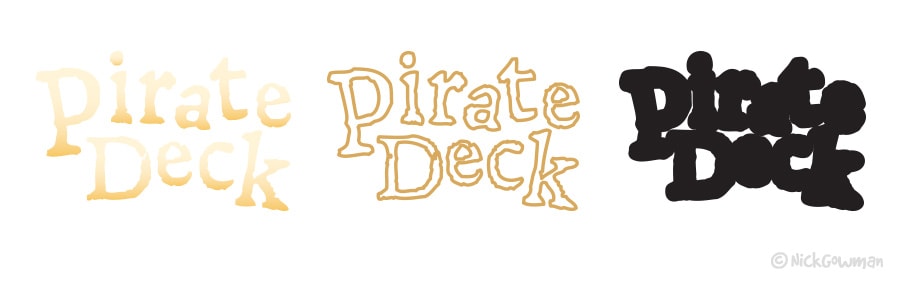
The first step when creating my lettering was to select a sturdy typeface as a starting point. I wanted something to reflect the rough and ready feel of something that had been around for some time and had a worn or burnished quality about it.
For this purpose, I chose ‘Leander’ as this has a very quirky and broken feel to it, with lots of twists and uneven features – perfect for pirates.
So as a starting point I began by simply writing out the name in Adobe Illustrator and then separated all characters before converting them to outlines, which essentially makes them all separate vector shapes to work with.
I then began arranging the letters into some compositions that could lend themselves to the logo being cut from a rock face or similar, trying where I could to lock the two words ‘pirate’ and ‘deck’ into each other.
Adding some Col-aaaargh
As far as colours are concerned, this lettering will be used on a variety of backgrounds, such as wooden style decks and also deep blue seas.
So have decided that I’ll need something that will contrast well, and so will use a variety of earthen tones for the lettering and have them graduated from light to dark tones. I also experimented with a more ‘orangey’ tone in the palette, but not sure if this is a little too bright and strong.
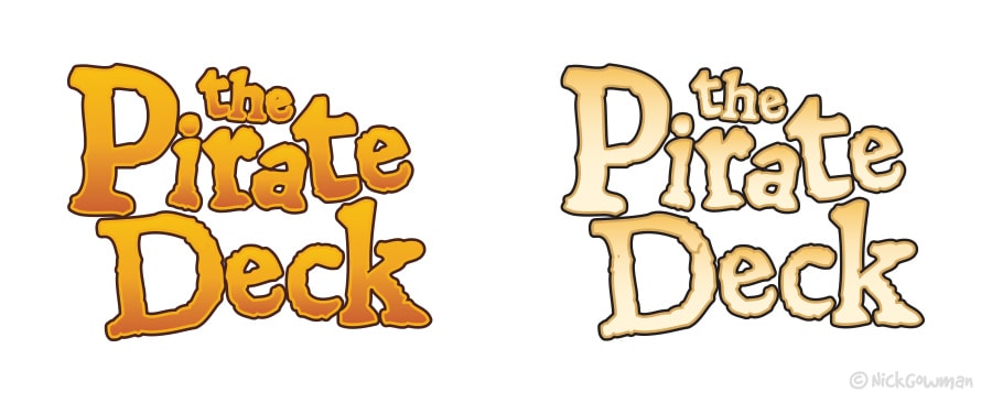
I’m also feeling that a bold dark surround will also benefit the letters, enabling them to stand out nicely.
So in order to accomplish this, I layered up three copies of my lettering – a first with a gradient colour fill, a second with a fine earthen outline and then a third, comprising of the bold, dark outline.
The reason I added in the middle ‘outline’ layer, as opposed to adding a stroke onto the first lettering is that the typeface has some fine cracks and details and found if I added a stroke, these details were lost.
When these three versions were then stacked up, they create the final multi-depth artwork.
Other pirate themed details
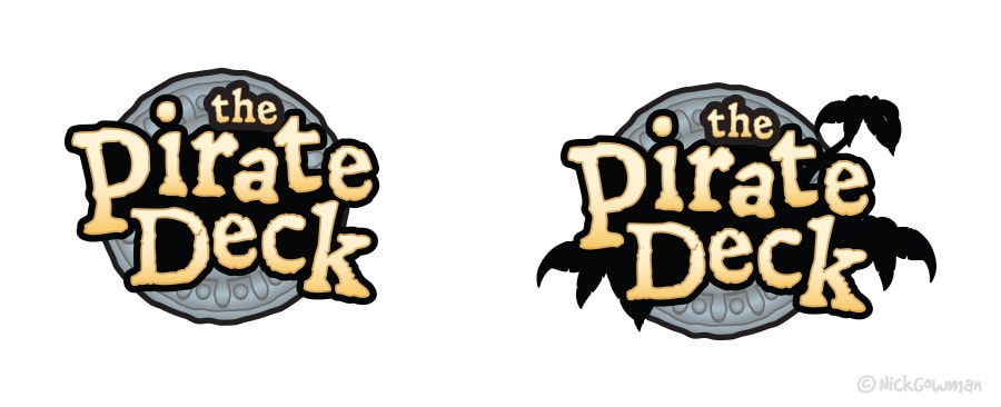
In order to give the logo a kind of ‘seal’ quality to it, I also played with the idea of having one of my gold doubloons as a backdrop to the lettering.
I also had some palm trees on file that I’d created from some earlier work on this pirate project and decided to try and incorporate these, although as a silhouette instead of the original, full-colour artwork.
My only concern with these is that they give the piece a more ‘Tarzan’ or ‘Lost World’ quality, rather than pirates and high-seas, so I’m thinking these might have to be omitted.
The other obvious concern with this layout and design is that a round logo like this won’t work so well along the ‘letterbox’ shaped sides of the box and so was abandoned in favour of something much simpler.
Furth-aaargh development…
Ok, so now we have the colours and basic arrangement in place, it was time to fine-tune the composition.
The biggest issue was of course that when the letters are arranged, they have adequate spacing between them. When the different coloured layers are placed on top of each other, everything looks a little ‘cramped’.
This was overcome by (painstakingly) taking the first layer, arranging the letters and then creating the three layers and their colours as before and overlaying them and repeating the process until I was happy with the result.
The positioning of ‘the’ also needed some consideration, so that it looks part of the logo and not just ‘stuck on’.
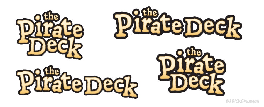
As you can see from the example above, the right-hand versions of the logo have a much stronger outline than those on the left and really helps to lift the logo off the page.